Responsive Web Design
"The mobile internet is ramping faster than desktop internet did, and we believe more users may connect to the internet via mobile devices than desktop pc's within five years." Morgan Stanley Research
Is your site mobile ready? We can help.
You can see some of our work on our home page.
What is a responsive website?
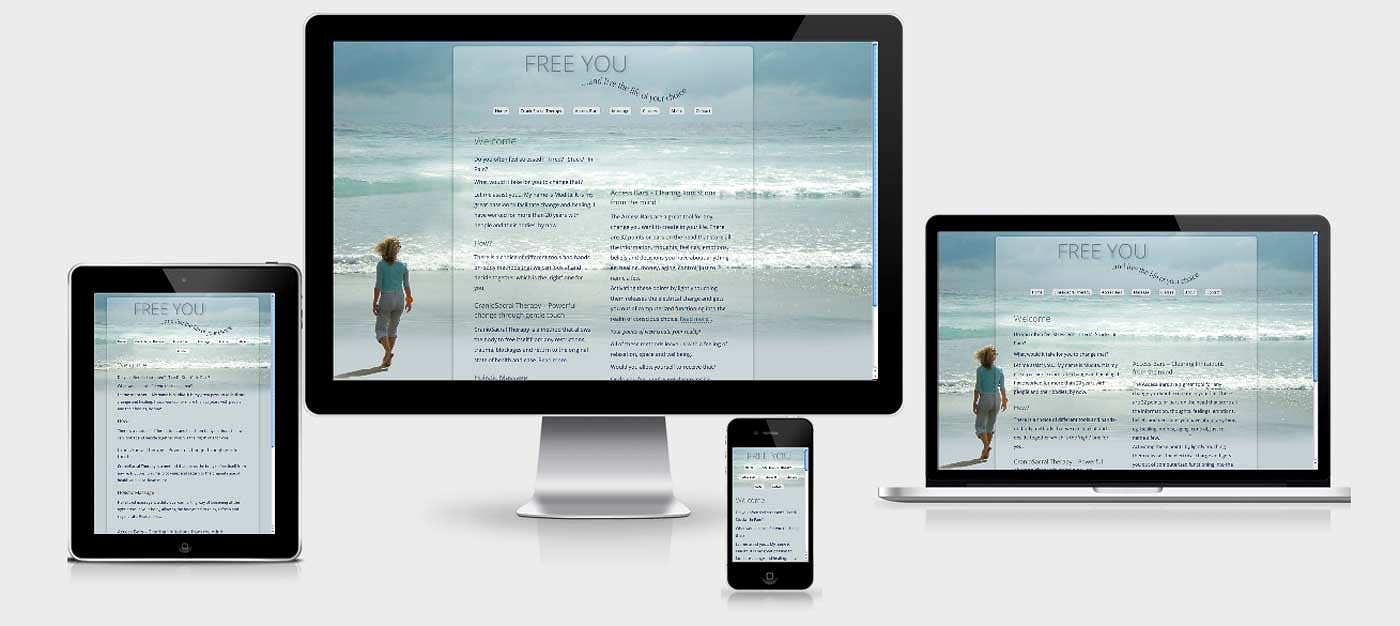
A responsive website is a website that adjusts itself to every reading device. The content automatically "snaps" to the frame, regardless of screen size (no more pinching and zooming). The user experience is uniform across all devices.
Looking good on mobile
You might have noticed that websites look different on an iPad or iPhone than on your computer. That's because most websites were made at a time when mobile web viewing didn't exist.
Now people are increasingly expecting a good experience on any device they might use to browse the internet.
Responsive web design creates websites that 'respond' to the width of the device.
The best way to illustrate this is to hold an iPad 'in landscape' (wide view) and then turn it around to 'portrait' (tall view). If you were to view this website, you would notice that this text column changes depending on how you hold the iPad.
In a similar way pictures and videos adjust to the way you're holding your iPad. The same goes for an iPhone, Android and other mobile devices.
Responsive websites offer the viewer an optimized web experience.
Reading text is easier
Reading text on a responsive website will be easier because the type size will adjust to suit whatever device you're using. On the iPhone the text column will always take the full width of the screen without the need for 'horizontal scrolling'.
Responsive web design FAQ
Why should I switch my website to responsive design?
Your website looks good on a computer screen but the same may not be true when your site is viewed on an iPhone or iPad. Once you make the design responsive, the website will look great (and be readable) on all screens not just the computer, making your information easier to access.
A responsive website will likely appeal to younger (net-native) people, because it will look more contemporary.
Responsive websites are easier to maintain.
Is responsive web design expensive?
No, we are charging the same per-page price, see here
Will a responsive website do better in Google's search rankings?
Yes, Google Panda first rolled out in February of 2011 and the world of search engine optimization has never been the same since. The goal of Panda is to improve the ranking of high-quality websites in Google while diminishing the rankings of low-quality sites.
One clear takeaway from Panda has been that sites with good user experience metrics, such as low bounce rate, solid time on site, high returning visits, consistent branded search traffic, and low exit rate percentage - have generally performed well in Panda.
But with the huge diversification in devices, high-quality user experience becomes all the more difficult. This is why a Responsive Web Design can be a great solution for website owners, because its goal is to improve user experience which clearly is a goal of Google's algorithm.
Is this website a responsive website?
Yes, just narrow the width of you browser window (bottom right corner) and you'll see what I mean.
Is mobile browsing on the rise?
How can I see if my website is already responsive or not?
You can test your website with this online tool. Google has a tool too. And Google wrote an article on the importance of mobile friendly websites.
Where can I read an in-depth article about responsive web design?
"A modular scale, like a musical scale, is a prearranged set of harmonious proportions." - Robert Bringhurst
A responsive website means that your website will rearrange itself based upon the device you are using.